Chasing the Three-Foot Effect
The instant of shopper-to-product engagement, known as the “three-foot effect,” is that moment in time when the colors and images of a label leap from store shelves to a customer’s eyes. A hand reaches for the container, the label is studied and examined, the contents imagined, and if the label does its job, a purchase is made.
This immediacy is especially important in the burgeoning market of craft- and micro-brewed beers. In this segment, the look and feel of the label on a bottle is a critical part of the purchase decision. More than branding, a label provides a unique look and gives hints of experience to be at once imagined and savored. With competitors vying for shelf space, a company’s label can be a deciding factor for malt and hops aficionados when deciding which new beer to try or when searching store shelves a favored brew.
![]() This is not lost on Church Street Brewing based in the Chicago suburb of Itasca. On the limited real estate of a beer label, logos and product names must be memorable and maintain branding across the company’s product line. Colors must be consistent and accurately rendered on labels, cartons, and cases, even when job specs include demanding features such as spot colors, metallics, and laser-trimming. And for small brewers, short runs—such as those for test marketing or the introduction of limited batches—can pose a significant challenge. Such a label run may amount to only a few hundred bottles at a time, yet every bottle must be clearly branded to foster loyalty while encouraging shoppers to sample a new brew.
This is not lost on Church Street Brewing based in the Chicago suburb of Itasca. On the limited real estate of a beer label, logos and product names must be memorable and maintain branding across the company’s product line. Colors must be consistent and accurately rendered on labels, cartons, and cases, even when job specs include demanding features such as spot colors, metallics, and laser-trimming. And for small brewers, short runs—such as those for test marketing or the introduction of limited batches—can pose a significant challenge. Such a label run may amount to only a few hundred bottles at a time, yet every bottle must be clearly branded to foster loyalty while encouraging shoppers to sample a new brew.
Small Batches and Short-Run Labels
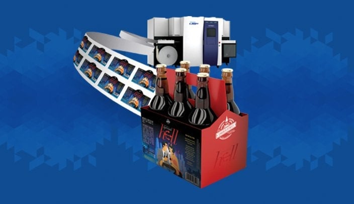
For example, Church Street Brewing recently needed a short run of labels for the launch of its latest creation, “Special Hell,” which, as its name denotes, is a pale German-style brew. The company looked to digital printing as the most cost-effective option and sought to ensure the labels would be of the highest quality, featured compelling colors and designs, and would stand up to the rigors of both retail shelves and consumers’ refrigerators and coolers.
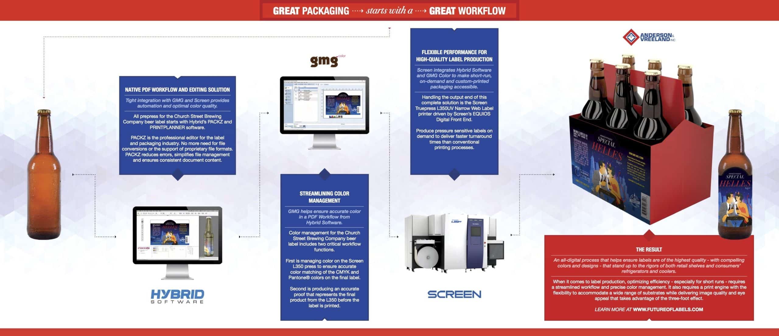
New to using digital printing, Church Street took a holistic approach to ensure the new labels met all expectations and would deliver the three-foot effect needed at retail. By putting it all together, Church Street’s owners worked with Anderson & Vreeland and three of its partners—Hybrid Software, GMG Color, and Screen USA, as well as the label designer. Having all the players in the loop from the beginning helped ensure the final labels met everyone’s vision and expectations.
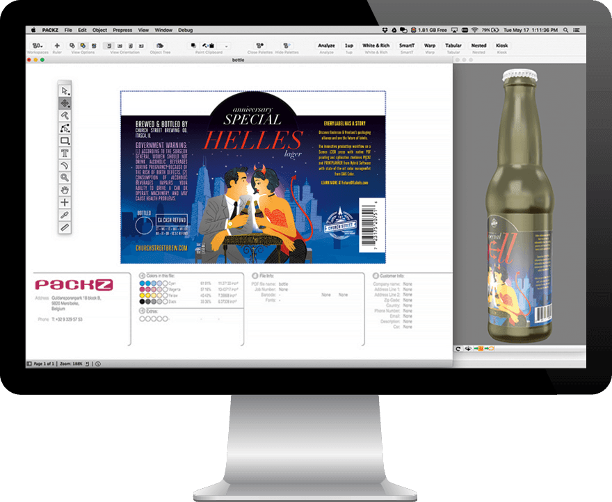
A screenshot of a label in Hybrid Software’s PackZ
Once the design was finalized it entered a native PDF workflow using PACKZ and PRINTPLANNER from Hybrid Software, applications that connected with comprehensive, state-of-the-art color management from GMG Color, a process designed to ensure optimal print quality on conventional or digital presses. The resulting files were fed to a Screen Truepress L350 UV inkjet press, chosen for its speed, range of substrates, UV inks, and image quality and durability of output. The result? Superior quality short-run print production that ensured each label, down to the finest details, was accurately produced and ready to stake out Church Street Brewery’s place on retail shelves.
The Digital Workflow
The first part of the story, available in Part One of a three-part white paper provides the details of how PACKZ and PRINTPLANNER tools from Hybrid Software empowered the prepress process. In July, Part Two will explain how GMG Color helped ensure the complex mix of colors used on the new label was fully managed to ensure the best possible results.
Part Three of the paper—coming in August—will share how the job was produced on the Screen Truepress L350 UV press and how the labels will be printed live at Labelexpo in Rosemont, Illinois in September, where you will be able to get your very own sample of Church Street’s Special Hell and its label fresh off a Screen Truepress L350UV.